In this Artist Insights, Ray Kleinlein details how his artistic approach has evolved to today, with a focus on his work with striped shirts.
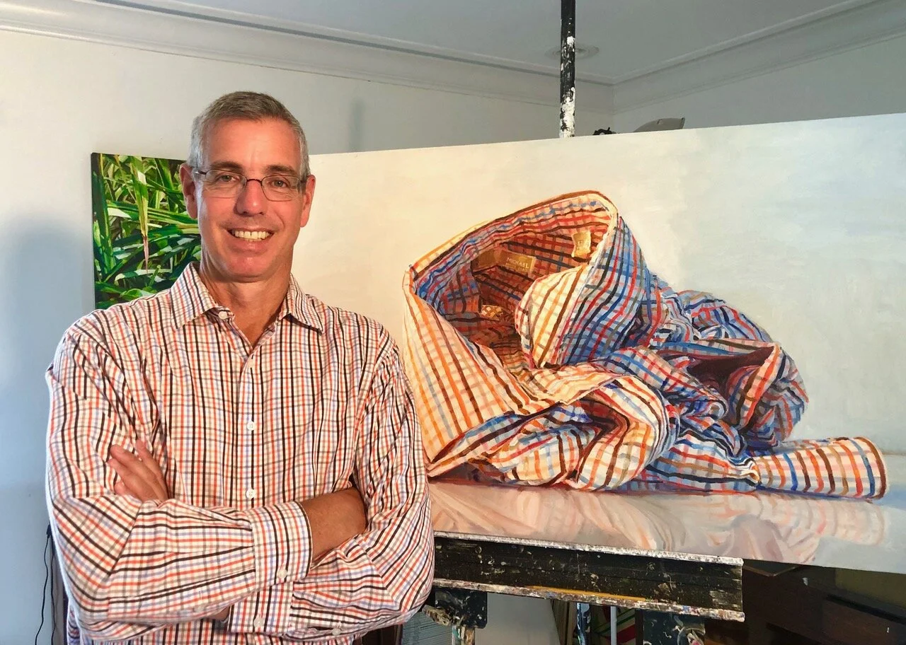
Ray Kleinlein in studio with “Orange and Blue Stripes” while wearing the featured orange and blue striped shirt.
I first noticed the multi-colored, vertical-striped shirt in 2002, on my honeymoon in Paris. I liked the look but didn’t buy one for myself. Back in the States I became obsessed with finding a striped shirt. It took several years for the style to become popular in America so whenever I found one it was like finding a hidden treasure. I’ve amassed quite an array in the ensuing 18 years. In fact, all the shirts I wear now—short and long sleeved, casual and dress—have stripes. When my daughter, in second grade, brought home a men’s shirt she saw in the lost and found at her school, I asked her why she thought it was mine. She said, “Because it has stripes.” Striped shirts have become an integral part of my identity.
For me there is something pleasing and reassuring about the rhythmic repetition of stripes. Within the insistent constancy of the stripe pattern there is the limitless freedom of variations of color, direction, width, etc. Artists who paint stripes like Frank Stella, Bridget Riley, Gene Davis, and Agnes Martin, to name a few, are among my favorites. After describing my admiration of their stripe paintings in graduate school, a professor asked me why I didn’t paint stripes myself. My answer was that I’m a representational painter, not an abstract or minimal painter. I’m an observer who loves the magic that happens when the real world is transformed into a painted image. I paint ordinary objects from the visual landscape of my daily life.

Ray Kleinlein’s, “Orange and Blue Stripes,” in progress.
The first time I painted one of my striped shirts was, like most revelations, an epiphany of something that was so obvious. Because I was more interested in painting the stripe pattern than a portrait of a shirt, I decided to ball up the shirt to make it less recognizable as a shirt and more of an abstract sculptural form. The orderly perfection of the stripes became confusing and chaotic. Though I yearn for the serene perfection of Agnes Martin’s stripes, life gives me a crumpled-up shirt on the bedroom floor. In my paintings, however, the shirt is deliberately taken out of its everyday environment and re-contextualized in abstract, minimal space: a quiet, clean, conceptual space intended to invite the viewer to slow down and meditate on the painting, rather than think about the narrative of a crumpled shirt on a floor.

Ray Kleinlein’s, “Orange and Blue Stripes,” in progress.
On my first attempt at painting a crumpled-up shirt I learned, too late, about the effect of gravity on the folds in the fabric which start to sag. So much changed from one day to the next that painting from direct observation only would not work. Consequently, unlike most of my other work, my paintings of shirts are done from a combination of photograph and direct observation. I look at a photograph for the structural form of the shirt. I look at the actual shirt under strong studio lights for the color and light.
As with all my paintings, I do an initial lay-in of color in thin washes to cover the white of the bare canvas. Often this initial lay-in only takes one session, but because the stripe pattern is complicated, for this painting it took several days. And this particular shirt is a bit of an anomaly in my collection of shirts—and my paintings of them—because there are horizontal as well as vertical stripes.
After the initial lay-in, I repaint the entire canvas in a thick impasto. Reproduced in small images my work often looks more illusionistic or “trompe l’oeil” that it actually is. I want the viewer to see that they are looking paint dragged around by a brush manipulated by a human hand. Brushstrokes and globs of dried paint are left visible. The lines of the stripes are not perfect. The lettering of the label is just suggested.

Ray Kleinlein’s selection of striped shirts, including the featured orange and blue striped shirt.
I may repaint the entire canvas several times trying to get the light and color just right. I say “right” rather than “accurate” because although my work is based in reality and direct observation, my goal is not a faithful mimesis of reality. My goal is a work of art that is both a convincing representation of reality as well as a compelling abstract arrangement of light, color, and form. I take liberties with light and color to achieve this sense of “rightness.” As the painting progresses, I look less and less at the shirt on the table in front of me and more and more at the painting itself.
The title of this painting is “Blue and Orange Stripes” and not “Crumpled Shirt” because I’m less concerned with the object, the shirt, and more concerned with light, color, and composition. These are the same concerns as those of the abstract and minimal painters of stripes like Gene Davis and the others I mentioned earlier. So, I too make stripe paintings and have become an abstract painter as well as a representational one.