Please enjoy our second in the series Artist Insights. Below, Stephanie Schechter walks us through the stages of her painting Luxury.

Stephanie Schechter with Wein-O-Rama, oil on canvas, 20.5 x 50 in.
“It’s hard to explain why, but certain signs just “speak to me” and “ask” to become paintings. I noticed the Luxury Dry Cleaners building for the first time when driving through nearby Lincoln, RI one evening. Something about the building and its sign caught my eye. It was dark out, but I could tell that the vintage, streamline style font of the sign was something special. I decided to return during the daytime to photograph it. I searched on Google Maps to determine when the sun would be on the face of the building. The building faces east, so I returned to photograph it in the morning. I photographed the facade of the building from numerous angles so I’d have a lot of reference images to work with back in the studio.
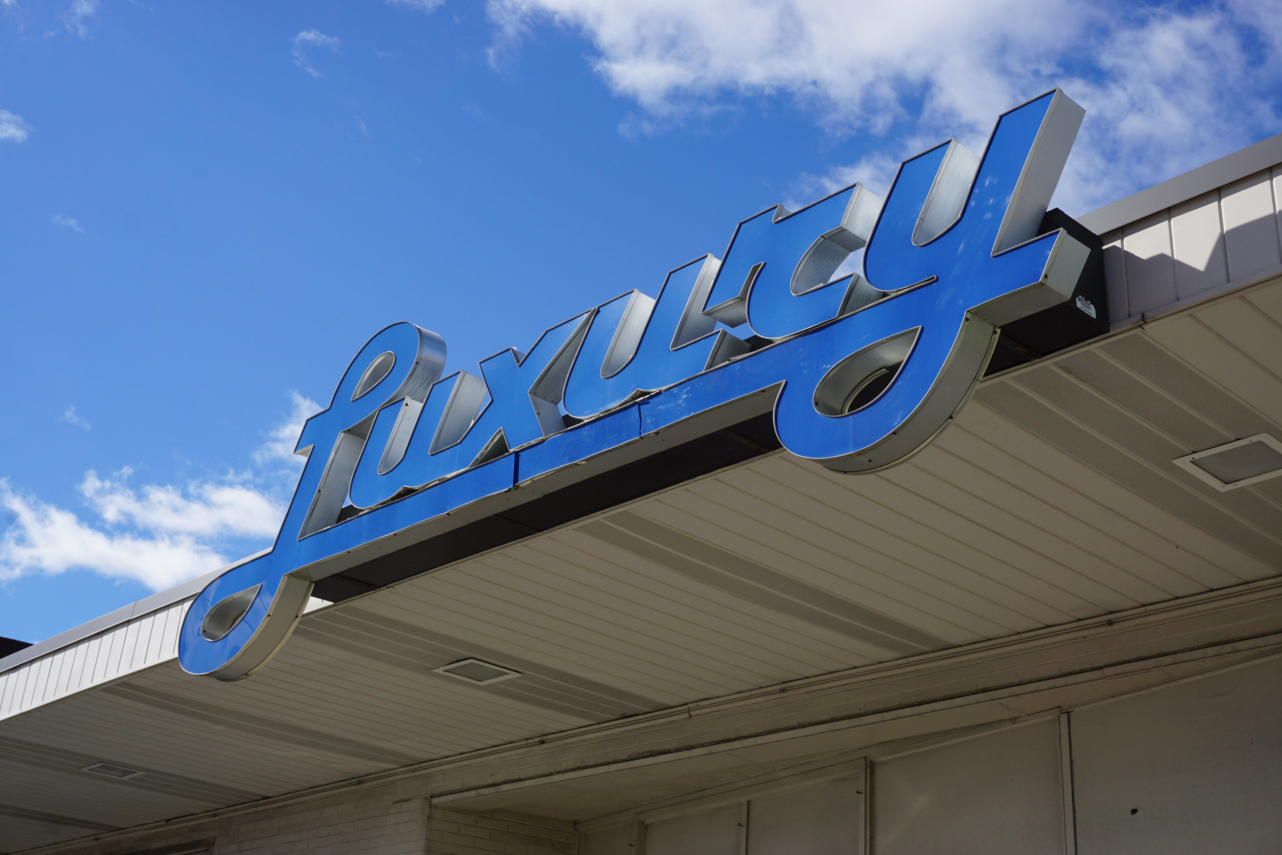
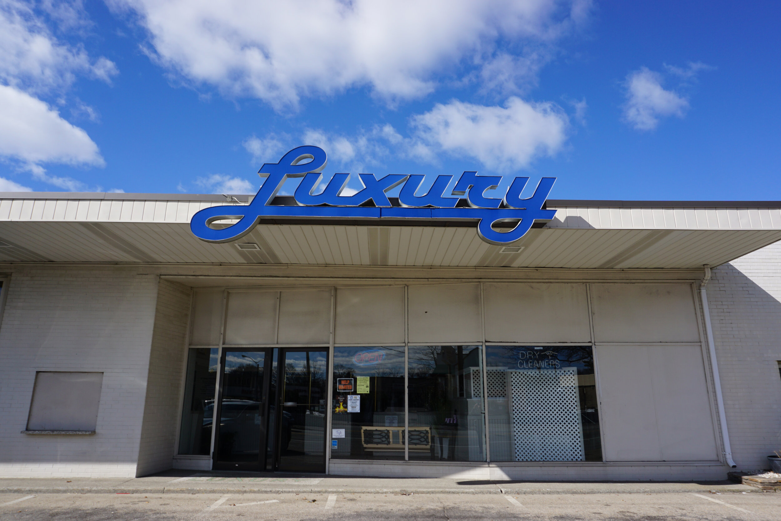
Back in the studio, I reviewed all of my photos. I started to fall in love with the idea of a painting that focused on the concept of “luxury,” but the shabbiness of the building was bothering me. When developing the concept for a new work, I believe that my job is to create a successful painting, not a copy of a photograph. To me, a successful painting articulates what the artist finds poignant about a particular subject. I decided that in order for me to tell this particular story, my painting would need to deviate quite a bit from reality.
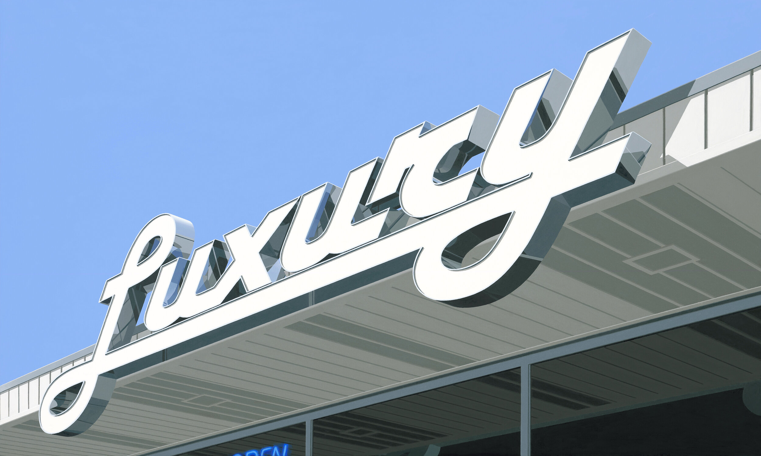
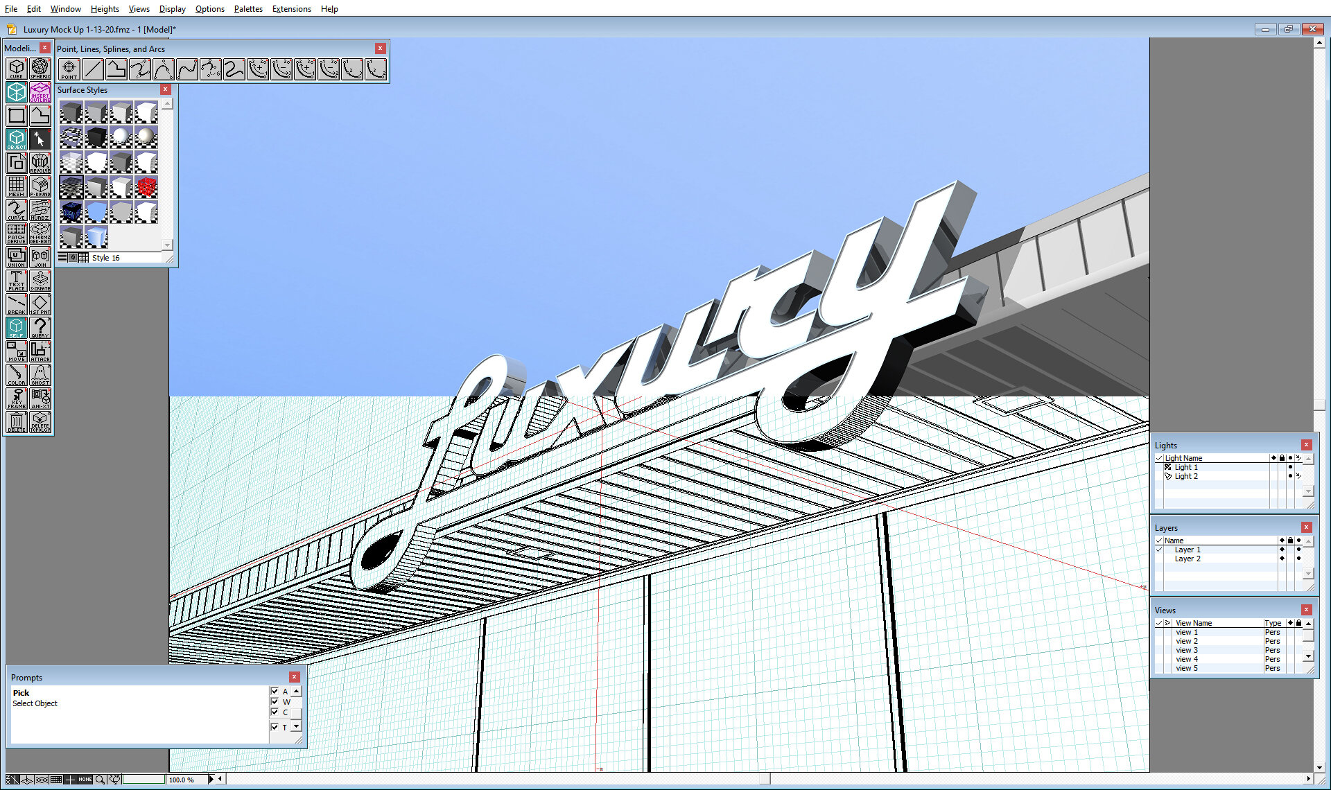
I wanted to maintain an impression of the real place, but capture a feeling of luxury. I started to think about what it would look like if it were a store that sold “luxury.” Although this is not my typical process, I decided that I could best manifest the vision in my head if I recreated the building’s facade and signage in my 3D industrial design software. Instead of duplicating exactly what exists in reality, I could create my idealized vision.
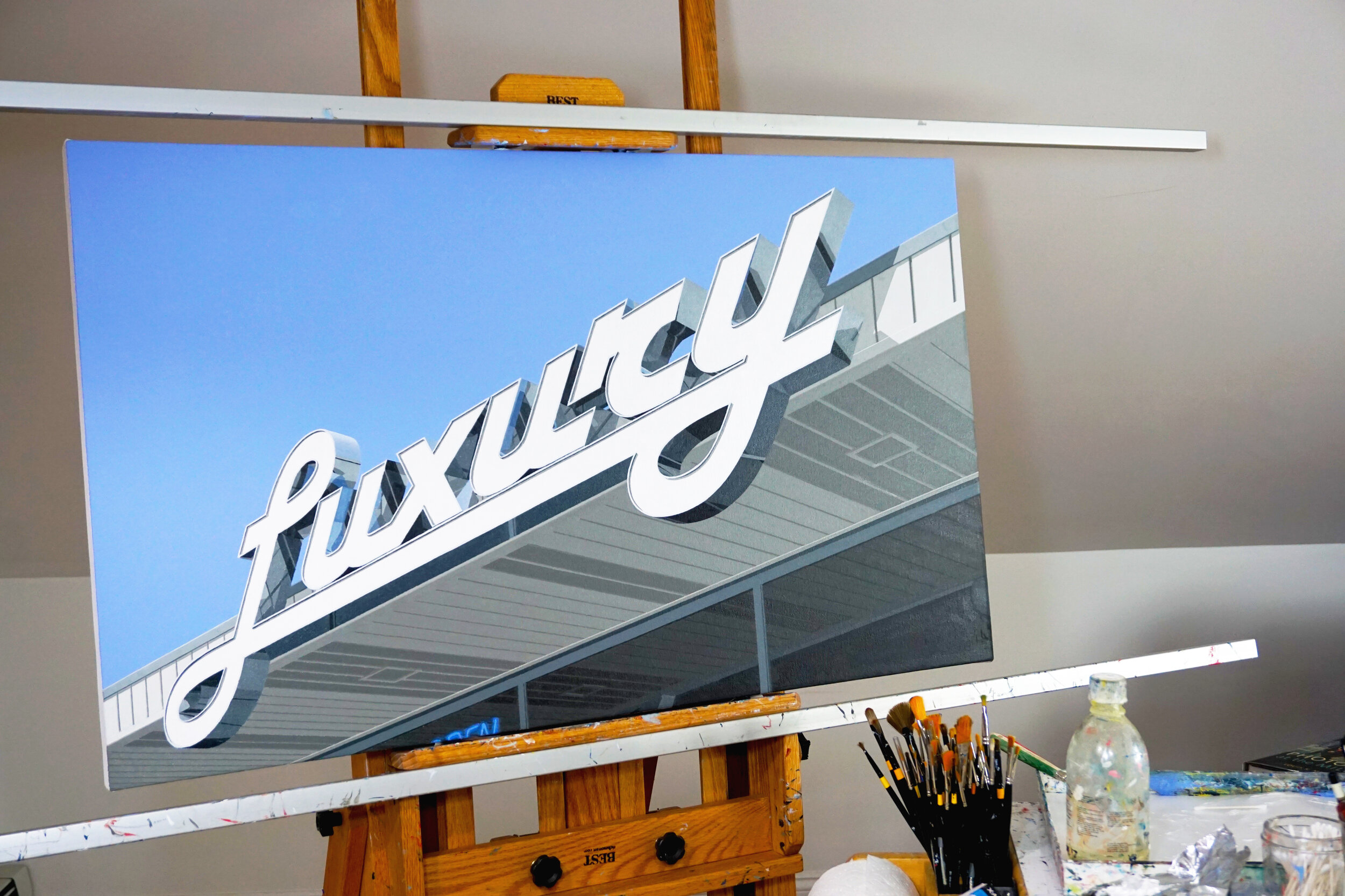
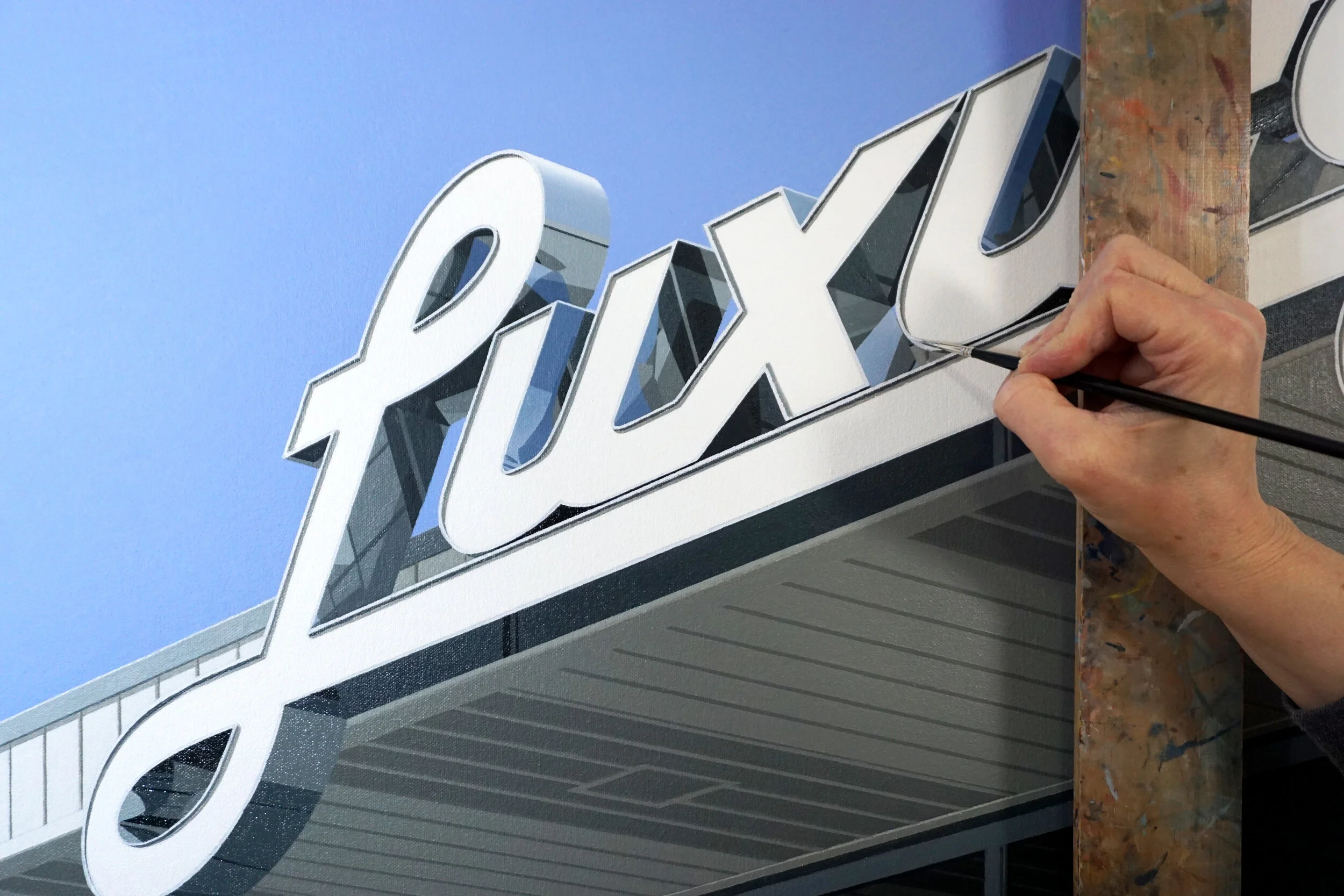
In this computer generated version, I decided to make the lettering white, for a cleaner look, and to assign a chrome surface to the sides of the letters, which created some exquisite reflections. While there are opaque panels above the windows on the actual building, I chose to make the windows the full height of the building, which allows for the reflection of the overhang to become a compositional element. I added a hint of the neon “OPEN” sign as an element of surprise and a pop of color in this otherwise muted work. The angle of the perspective was chosen so the lines of the building direct the eye towards the signage, which is the focal point of the painting.
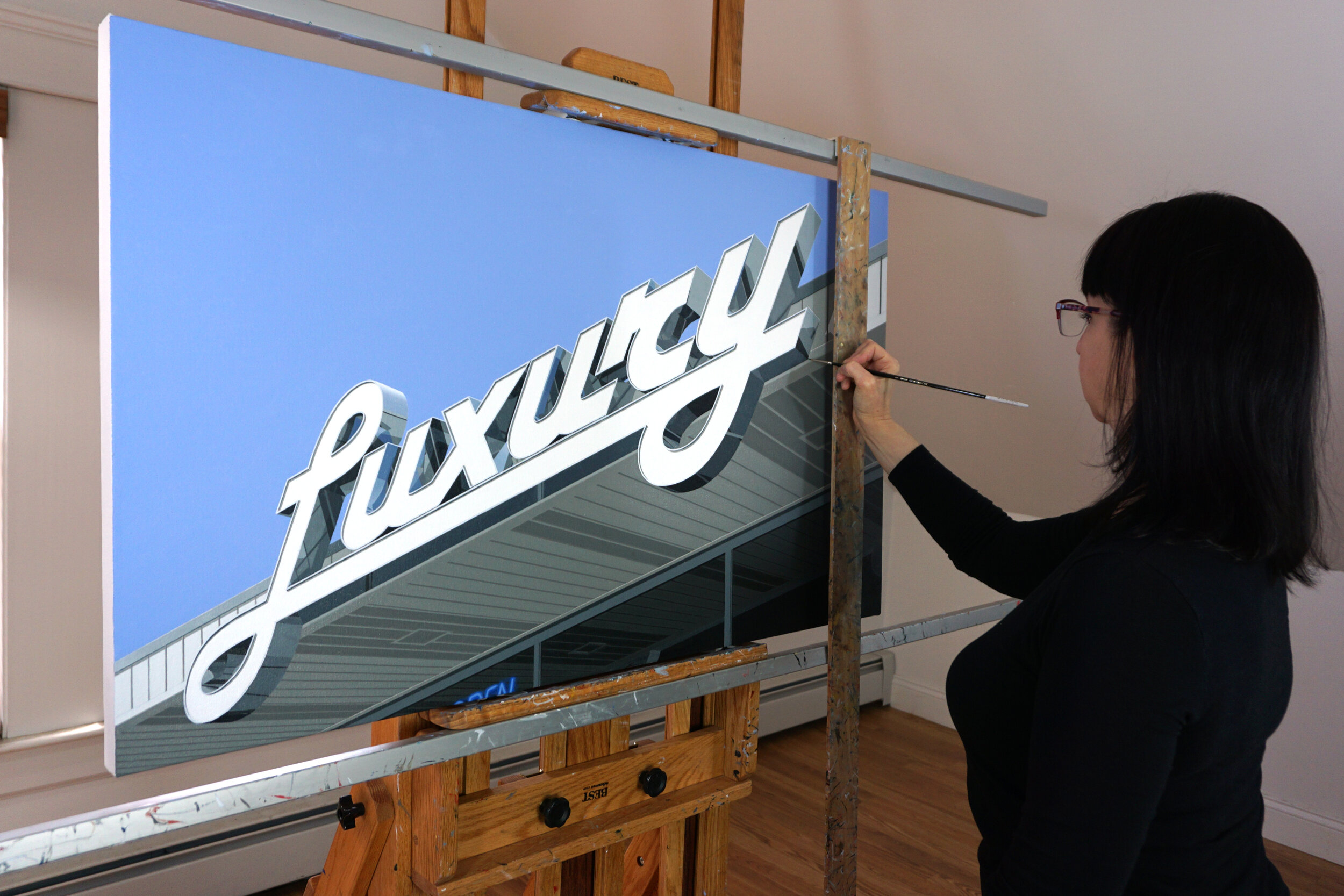
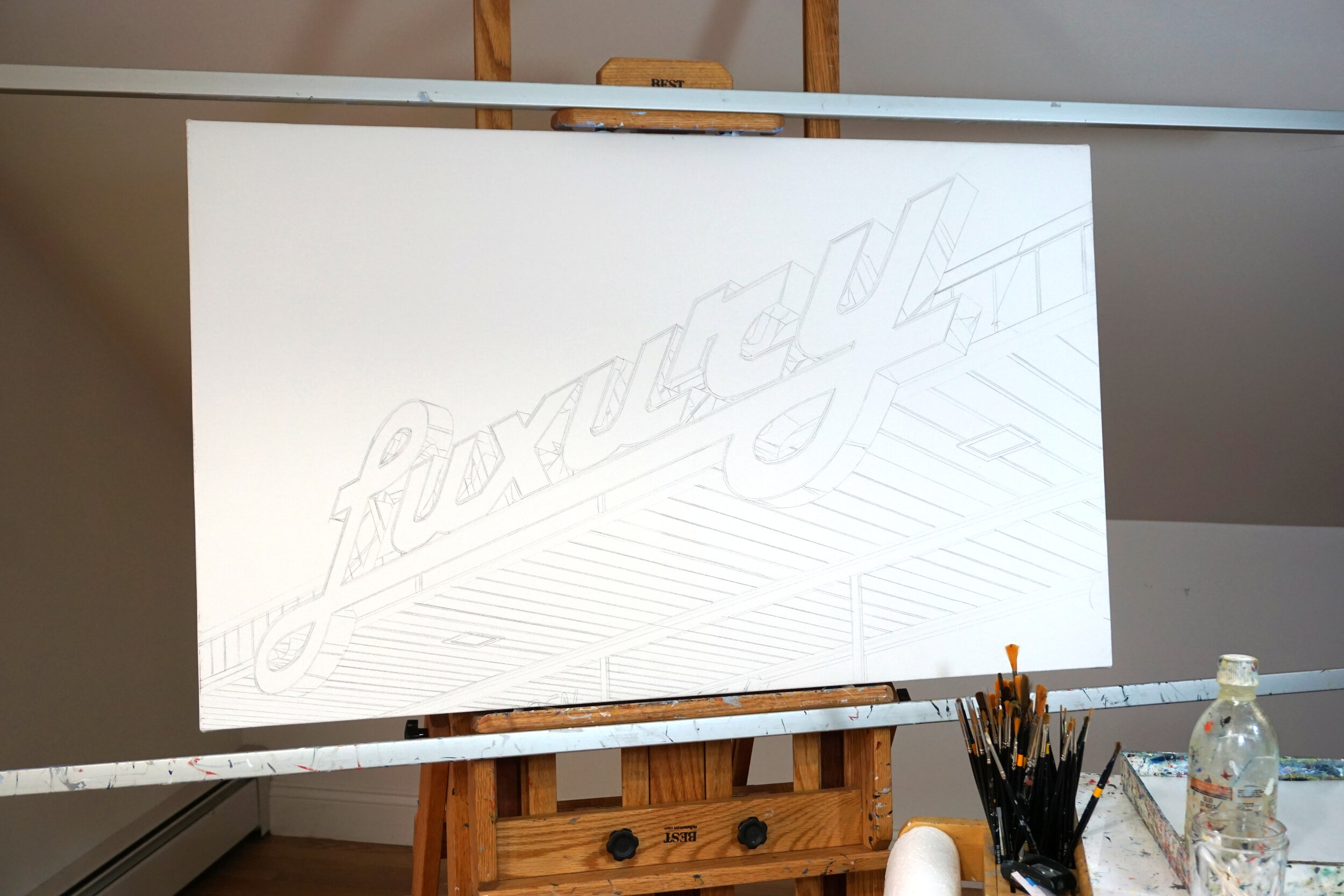
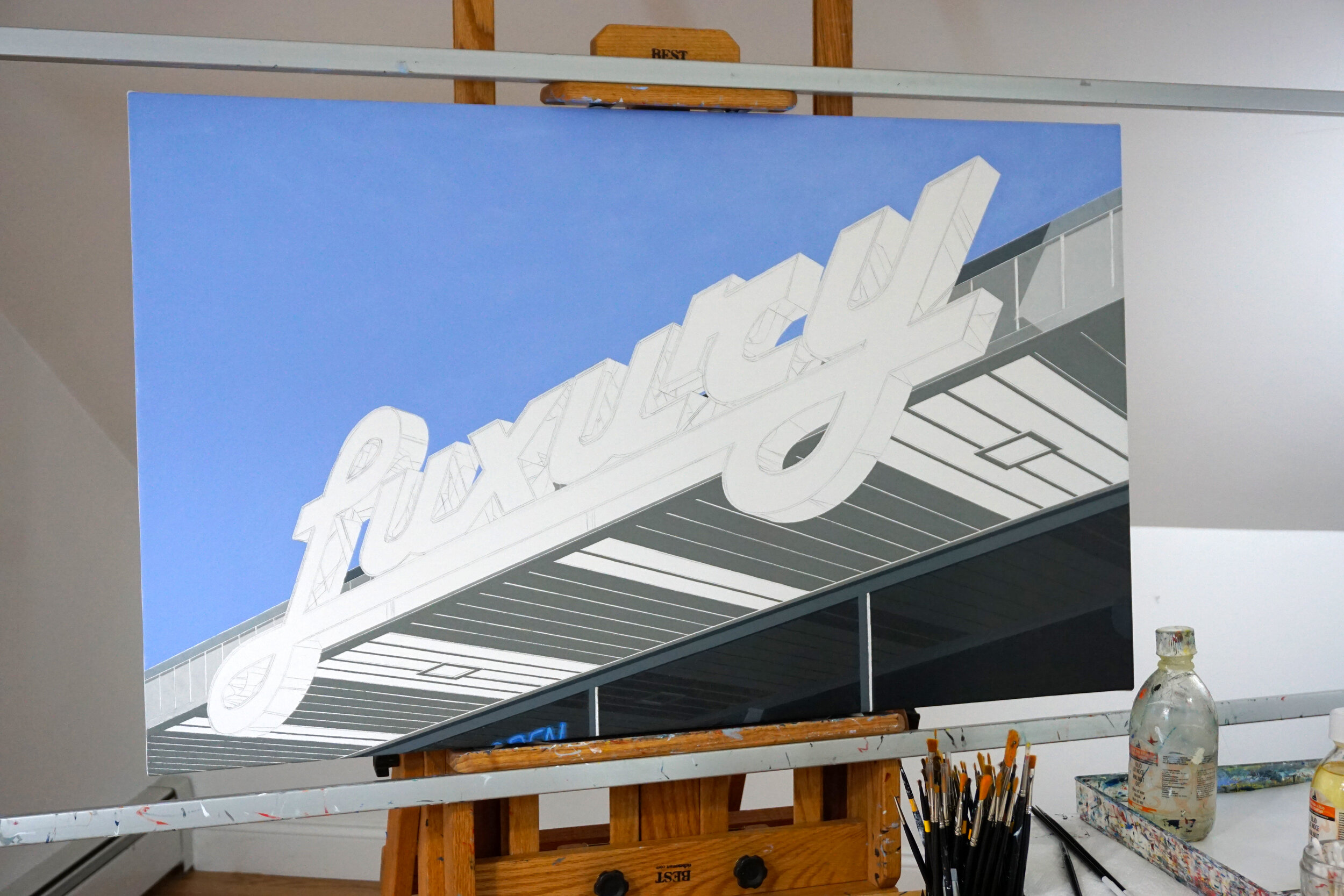
For Luxury, once the computer generated image was completed, I transferred the outlines to the canvas and began painting. I started by roughing in the first layer, covering the entire canvas. Once this first layer was complete and dry, I added a second layer for opacity and refinement. My process for creating Luxury was labor intensive, but I enjoyed every aspect of articulating what I find compelling about this subject through my painting.”
Over time, I’ve developed a painting process that enables me to best execute my vision. I strive for a meticulous, bold, graphic look. To achieve this, I primarily use a hardedged painting technique. I choose not to do any masking, as I find that masked edges can be obvious and create a stopping point for the eye. I have modified my easel with a hand rest which keeps my hand steady, in order to create precise lines and edges.