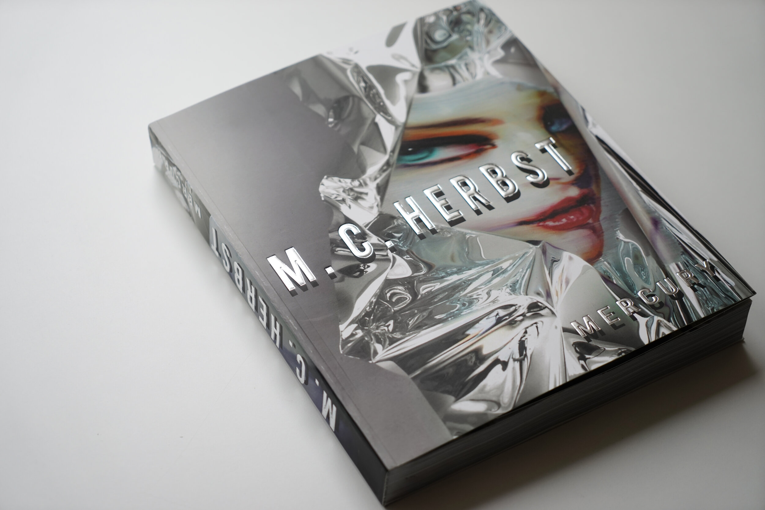
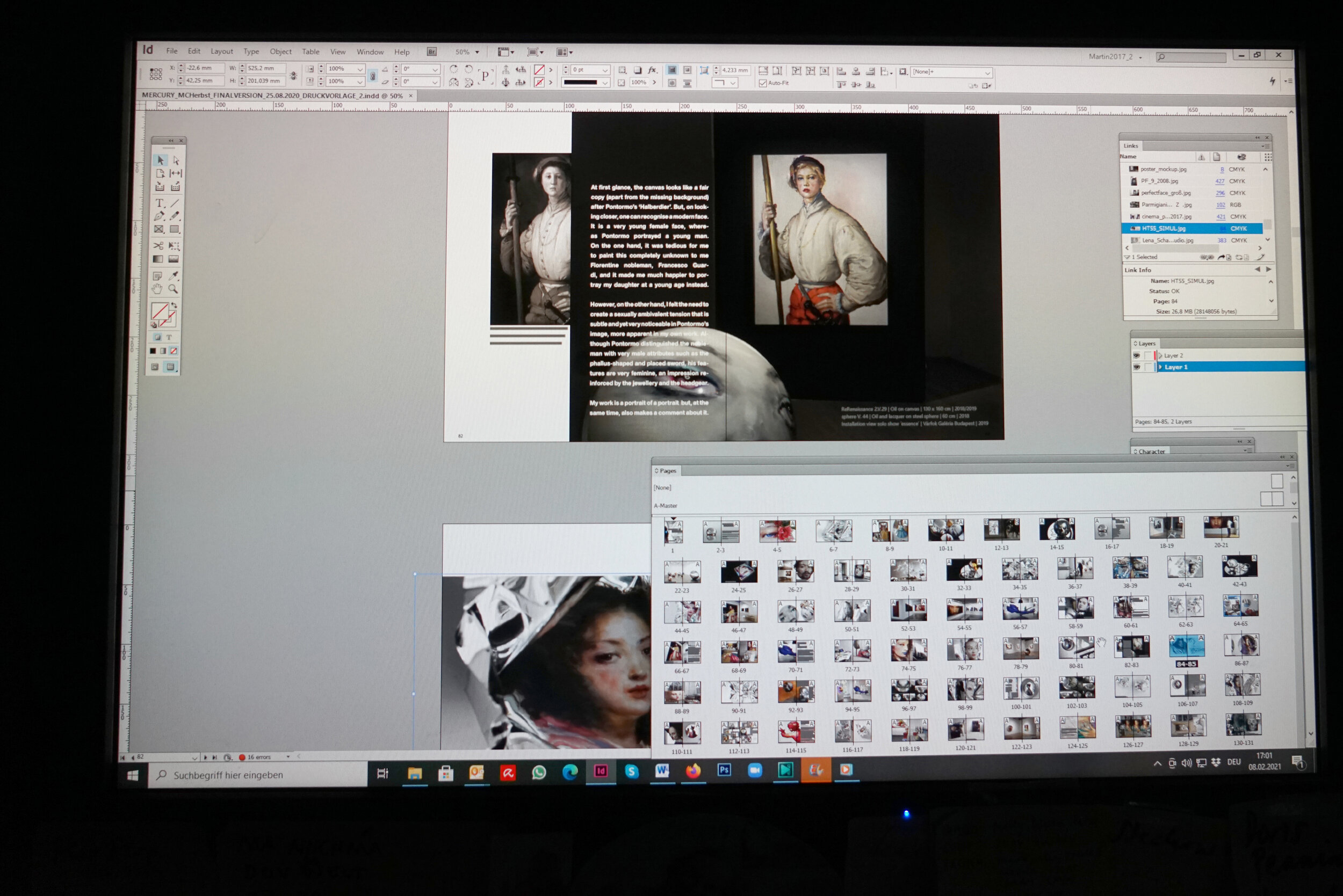
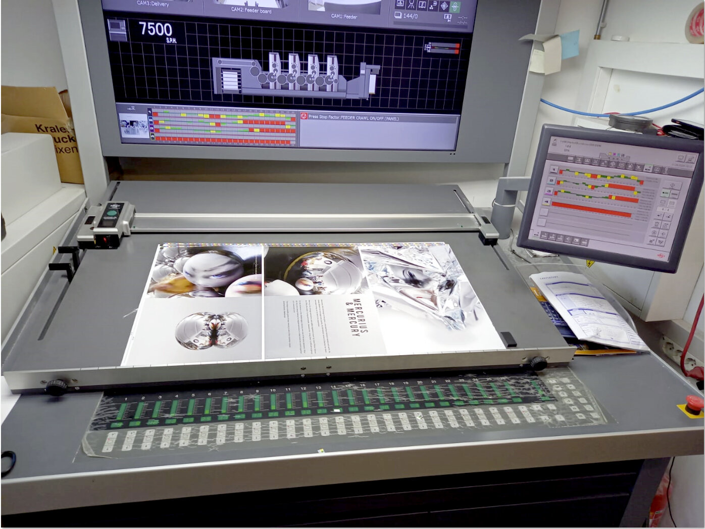
I planned to design a book featuring the past decade of my art for some years. An always tight show calendar left no time, but the pandemic did. Suddenly, I was free to sit down for a couple of months entirely focusing on the book concept and design – pure luxury! After many hours, long days, late nights, and a stint learning new software, my book Mercury came into being.
You may ask why I make such a fuss about a simple art book. The answer; It was not simple to make it and it is no simple book. My work is ripe with complex dimensions and often metallic qualities that pose particular challenges when it comes to documentation and presentation within a book format.
The Hidden Treasure series for example requires in person viewership and investigation to complete the work. As a viewer moves around a piece in this series, the delicately painted faces slip and morph in form. A video may somehow document the arrow of impressions the work offers, but never a static photo which can show only one image of the many.
So why to make a traditional book and not a film? Because there's life in the old dog yet! A book gently seduces a reader to build his own image in his own imagination and speed based on the information offered to him in elegant restraint. In this respect, a book and a work of art show great similarity and it seems fair to combine them.
Hidden Treasure, no. 34
And what about the problem of inadequate presentation? Its existence cannot be argued away but turned into an advantage. The shortage inspired me to stay away from the common bare listing of reproductions of my artworks, to get rid of the scheme left page work info and right page reproduction. My book should suggest more than document. It should give more a general feeling and understanding for my practice rather than illustrate singular works.
So what you get when you open Mercury is a rich array of photos and snapshots of my works taken in my studio, at art fairs and gallery shows, in the home of collectors. The row of images does not follow a particular scheme or theme but instead follows my intuition.
First, I sat down and browsed my comprehensive archive to make a raw selection. After some weeks I had a vague idea what to include, but no idea of the look and design of the book. I contacted several graphic designers and started with one to work. Just to switch to two others without achieving a pleasing result.
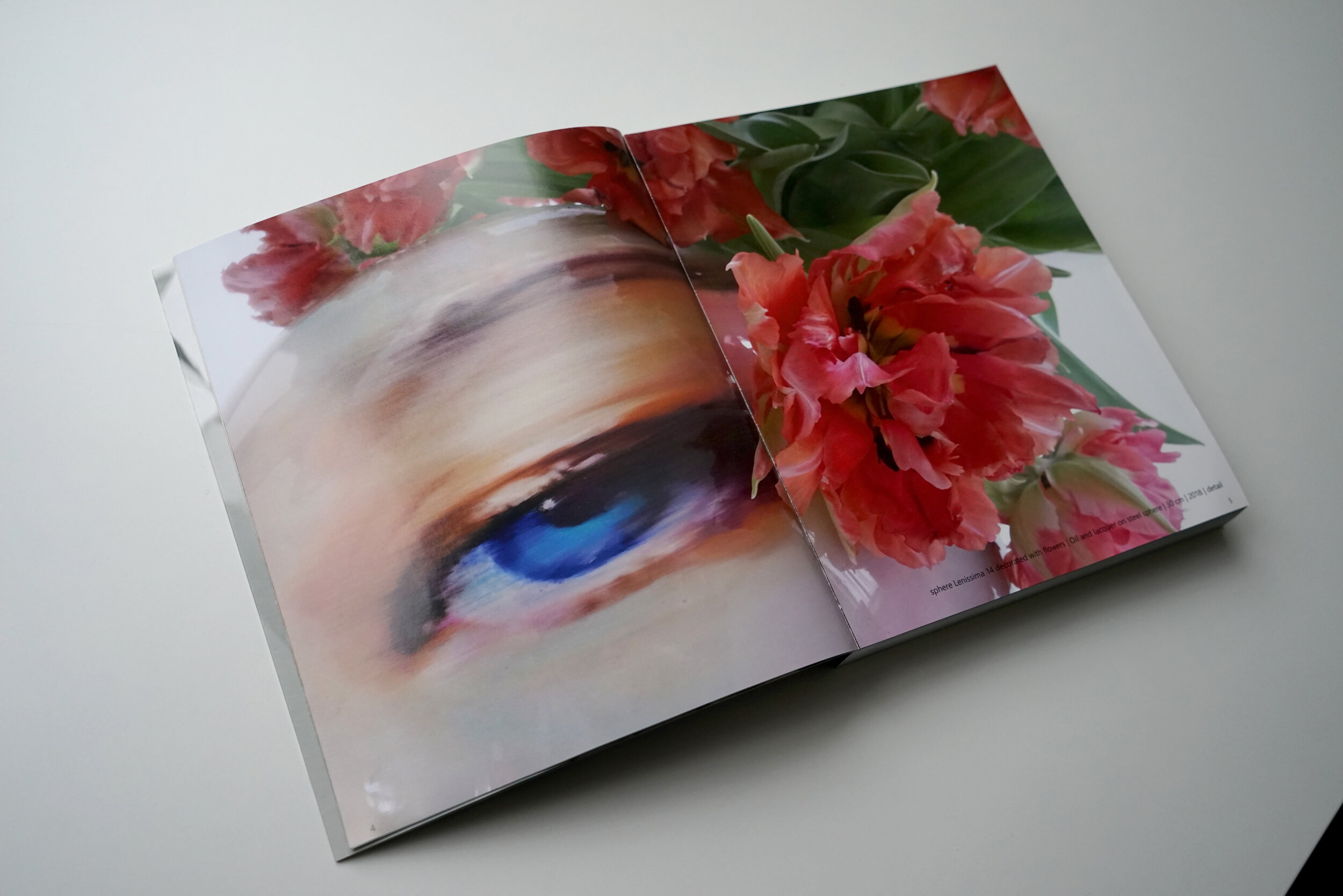
Eventually I surrendered, learned the most common graphic design program by myself and started to play around. I think it helped a lot that I had no experience in this field and therefore no traditional pattern in mind how an artist book should look alike. The graphic design surface was like an empty painting ground for me. It was clear right away then that the illustrations should fill the whole space of each double page with no ´frame´ of a white margin as none of my paintings require a frame or equivalent.
I use mainly photos in which the artworks are staged - I used to paint my subjects as if there would be nothing else of interest in the world. However, I have found they should be shown in the context of an interesting setting as my works have the quality to shape their surroundings. Some of my pieces may be installed in different ways and are therefore shown in different settings. Each of my Spheres, for instance, has no fixed standing position and can appear in various orientations which change their character and expression.
From there on the direction was clear, but a significant problem had to be solved yet which turned out to be very laborious. I could use only photos in which the main content was not in the centre but either on the right or the left sides since they had to work within a full double page. Otherwise, all content in the centre of the photo would be divided by the parting line of the fold in the middle of the book. Many photos of my archive were taken without this premise in mind. A lot of great shots had to be eliminated or reworked in Photoshop to a great extent.
Over the months the book grew organically. Rampantly as well since the book had nearly 440 pages in the end instead of the originally planned 220. Even though I never had planned a heavy coffee table book I had to face the fact that the heavy weight of 440 pages of art printing paper combined with a solid hard cover would not allow the reader to hold my book in one hand and flip through it conveniently. And so I did some research and found a very thin and light high quality printing paper. It was time to say goodbye to the prestigious hard cover as well simply because it would not fit the light and easy character of the book. Now, with its soft cover and decorated with a mirrored relief printing, it is more a magazine than a conventional art book.
Mercury takes you on a very personal journey of 15 years painting adventure. Start at any page, jump back and forth – you will get a pretty comprehensive picture of my practice in the end. And if you still have questions – yes, there is an instructive essay of art historian Zoltan Somhegyi included which may answer at least some of them. Don´t miss it.
